A New Culinary Destination
New York City’s Tin Building is a new culinary destination taking in six full-service restaurants, six fast casual outlets, three bars and private dining experiences. Jean-Georges Vongerichten has restored and reimagined this historic building, formerly the Fulton Fish Market, into a 53,000 sq ft food emporium, inspired by his childhood in Alsace and successful restaurants in Bangkok, Singapore, the US and Europe.

The Howard Hughes Corporation invited us to devise the visual merchandising scheme for the Tin Building. Jean-Georges is renowned for unparalleled hospitality; this is his first foray into retail and required specialist food hall expertise and an appreciation of detail and nuance. Our team drew on our heritage of creating premium food retail experiences, notably the original Harrods Food Hall.

Our initial scope included design for visual merchandising for all fresh and ambient products throughout the entire Tin Building. This comprised everything from risers and plinths to plates, slates and food service equipment as well as ticketing, tone of voice, communications and category signage.
In addition, we created detailed planograms and visualisations to enable the team to execute our designs with perfect accuracy. These function as a guideline for onward use, allowing the team to maintain, at scale, the standard of visual merchandising and product presentation that is required for a destination of Tin’s ambition and market position.
Spoiled Parrot: Tin's candy store

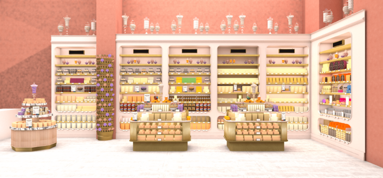
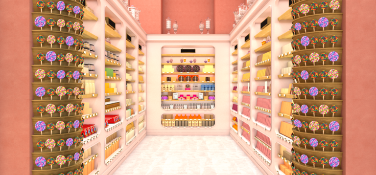
Spoiled Parrot is the confectionery destination, with a vast array of carefully chosen chocolate bars and sweet treats at a variety of price points. Bars are presented face-on with stock behind to showcase the beautiful packaging and glass cloches are used to reveal the chocolates inside the boxes. Small POS frames give additional information on products and provenance and glass urns filled with a range of pastel-coloured candy sit well within the environment. In a nod to the children’s story about a parrot who escapes and gorges himself on sweets to such an extent that he can’t fit back into his cage, we placed a birdcage with its door open on one of the main gondolas to lend height and capture shoppers’ attention.

Spoiled Parrot – initial render left wall

Spoiled Parrot – intial render back wall

Marketplace
Fruit and vegetables is also on the ground floor. We introduced wooden crates that hark back to the origins of markets. They include inserts, platforms and dividers to allow for flexibility in stock levels. Ticketing slots neatly into crates and can easily be changed in accordance with the seasons.
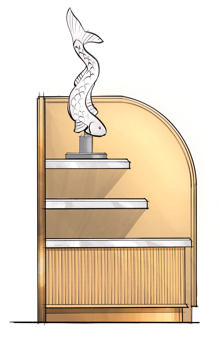
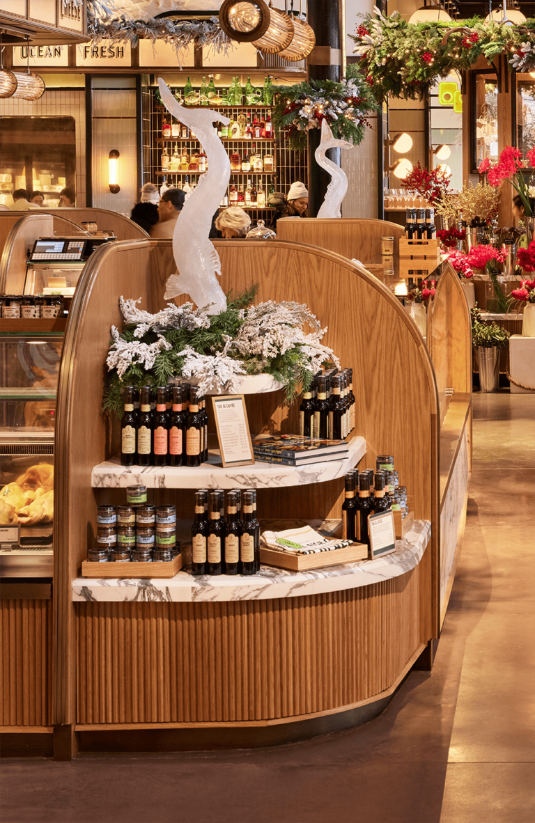
The fresh counters include fish, meat and cheese and benefit from carefully chosen display vessels that tier the product making the display dynamic and enticing. For fish we used a light palette to flatter the product; darker marbles and black slate are more effective backdrop for the meat and light marble effect slate was chosen for cheese and charcuterie. Cross-merchandising examples include small oak crates housing condiments and complementary items on top of refrigeration units. Notable features include the bespoke symmetrical fish sculptures at both ends of the fresh fish counter.

Bespoke fish sculpture – initial sketch

Bespoke fish sculpture – final view
In bakery, the front counter is a platform for the product to be tiered, showcasing the beautiful array of fresh bread as soon as they walk in. Our approach was ‘abundant but curated’, and we changed the display for different day parts, leveraging coffee and croissants in the morning and moving more into patisserie in the afternoon, signposting this offer with clean, crisp oak boards, wire baking racks and substantial baking tins alongside a marble finish for refrigerated product and discs to act as platforms for the celebratory cakes.
Mercantile

Mercantile, the ambient grocery and homewares offer is on the upper floor and Mercantile East focuses on East and South East Asia. Two homewares tables occupy the centre of the space, with hanging rails for kitchenware, bridges for height and recipe books by Jean-Georges open at a particular page to tell the product story and sell the ingredients and equipment required to make the dish. We created all the visual merchandising kit – from risers and bridges to trays and vitrines – to organise and display the products according to the ‘curated abundance’ aesthetic as well as highlighting Jean-Georges’s own-brand range.

Mercantile East

Mercantile
Winter Wonderland
On the basis of the execution of our initial scope, we were asked to look at the holiday season and worked with the buying team to bring in seasonal products. We created planograms so the team knew how to display items, designed the season-specific visual merchandising including vitrines with winter foliage, gold plinths and a hotel bellhop surrounding with gift boxes to highlight the gifting opportunity that rare and exquisite food and drink represents, working alongside the Tin’s florist Raquel Corvino. We used large vitrines to open up gift boxes and show what was inside and introduced baubles into the jars that usually contain candy.
In Mercantile we exchanged the characterful Tin-branded burlap banners hanging from the ceiling for festive-themed alternatives. The focus of our work was lighting and décor. Following a ‘winter wonderland’ theme, we suspended more than ten Christmas trees in the atrium, strew garlands around columns in the central market area, used fairy lights to add sparkle and twinkle and frosted white foliage to lead shoppers up to Mercantile.